Here are the “rules“.
If you’d like to see the full Marvel August Cover Solicits head on over to CBR.
Honestly? Not a great month for Marvel. I mean, there’s some awesome gorgeous stuff here, but they’ve been fucking killing it, and this was not one of their best months. There was even some not so great (on the offensive tip) stuff. Nothing end of the world-ish, but kinda a bummer nonetheless.
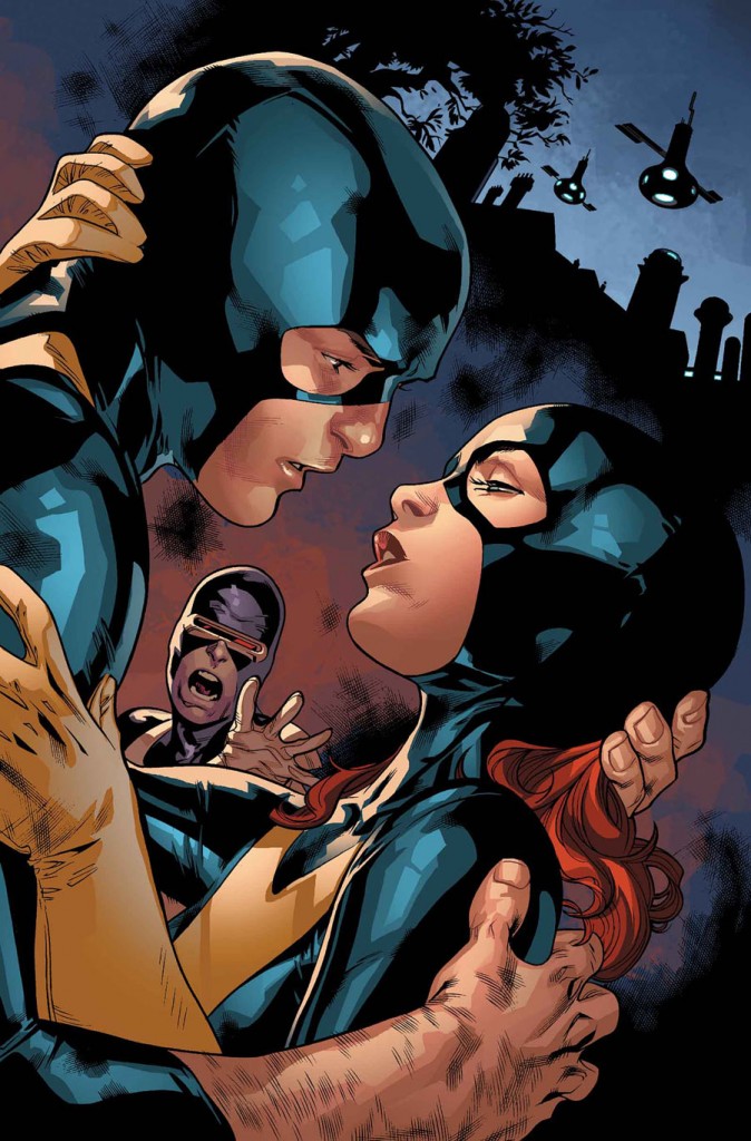
ALL NEW X-MEN 15. Damn. I hate that I’m remotely intrigued about who she’s about to kiss. Damn me and weak female brain!!!
Sidenote: It’s gotta be Warren, right? I mean it’s clearly one of the original five and it’s not Cyclops. It can’t be Iceman, because, well, Iceman. And Beast would be recognizable in the face, right?
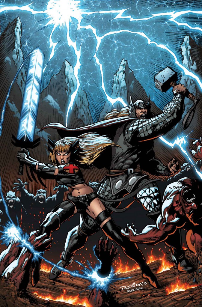
A+X 11. I kinda dig Mark Texeira. But I don’t love this. ![]()
ASTONISHING X-MEN 65. Digging the Iceman imagery, as well as the colors and negative space.
AVENGERS 17. You know, I don’t know who that green bitch is, but I REALLY appreciate that she put black electrical tape over her nipples, because otherwise this look might have been offensive. #goodjob!
AVENGERS ARENA 14. Generally Deodato and I don’t see eye to eye, but this ain’t bad.
AVENGERS ASSEMBLE 18. Minus the water balloon-like boobs, this is nice. Good, kind of terrifying expression.
CABLE & X-FORCE 13. Yawwwwwwnnnn.
Oh, I’m sorry, what???
CAPTAIN MARVEL 15. Very nice. I like the fiery hair, even if it is a bit “Phoenix-y.”
DAREDEVIL 30. Um.
I really like Samnee generally, but this looks like Silver Surver is straight up trying to ram a giant silver dildo up Daredevil’s ass. Right?
DAREDEVIL DARK NIGHTS 3. This is nice, I like the color contrasts (and the limited use) and of course the white space, but the whole ice-y beard and horns thing is making me laugh…not in a good way.
DEADPOOL KILLS 2. Gorgeous illustration work. Also, kind of gross, but mostly hilarious. APPROVED.
I mean, look at the little “Pac Man Deadpool eating hot dogs”!!! Priceless.
DEADPOOL 15. Awesome. Wonderful movement. Great positive and negative space, detailed illustration work combined with more graphic silhouettes. Love the lighting choices.
EMERALD CITY OZ 2. Adorable. Look at Dorothy. AH-MAZING.
FEARLESS DEFENDERS 8. Love it. Brooks has been killing it with the ideas for these FD covers, though sometimes the execution has not worked for me. Not so, here. THIS IS AMAZING. I love the costume (as we already know) but these illustrations are also great. Kind of an “Animal Man” vibe and just gorgeous pencil illustration work.
As a caveat (cause isn’t there always?) It kind of bums me out when I see an artist whose pencil/black and white work is way better than the colored work. So the case here…look at how GORGEOUS!!!
FF 11. I can’t articulate how fun this is.
You do it.
GAMBIT 16. See. I told you. Crocs!
Also, I feel like Gambit is competing with Nightwing for being Ass-tastic here.
This is a pretty good set up for a cover, but mostly I love the use of the title around the well/tunnel/whatever. Hopefully the final with all the other crap jammed on here won’t ruin it.
In other news, I’m pretty sure this book got canceled. This bums me out because I REALLY wanted to like it. I’d love to go in and revamp Gambit and make him relevant again, but the book just didn’t quite work. Maybe next time, kid.
GUARDIANS OF THE GALAXY 6. So…as y’all know I hate this “revamped costume” – I believe my quote was something about metal bikinis making about as much sense for battle armor as chainmail for swimmers…yeah, that was it. HOWEVER. And this is a big however…it probably deserves a separate paragraph.
WOO. Look how easy. You just hit return and there you are. (Jeezus I’m drunk, I guess I’m out of practice on these).
ANYWAY, what I was going to say was that SARA PICHELLI makes this fucking work. Really stunning illustration work.
HAWKEYE 14. Could I love this book more? Impossible.
As usual Aja is killing it on covers. Smart, cool, beautiful, super graphic and well-designed. Love
INDESTRUCTIBLE HULK 12. This is AMAZE-BALLS. So great. The textures are fucking fantastic. The illustration work is sublime. The colors are gorgeous. The expression on Hulk’s face? Priceless.
INFINITY 1 (Arthur Adams). Honestly? I cannot even see anything except Black Widow RIDING Hulk, which is THE. BEST. THING. EVER.
INFINITY 1 (Skottie Young Variant). WAIT. I spoke too soon. THIS! THIS. IS. THE. BEST. THING. EVER.
Can Skottie Young please do everything? Is there a way to actually make that happen? Someone look into that.
JOURNEY INTO MYSTERY 655. I can’t even fucking see this cover because my eyes are too full of goddamn tears over this book’s cancellation.
The ONLY silver lining is that maybe Marvel will be smart and put Valerio Schiti on an AMAZING book (HINT, HE WOULD BE PERFECT FOR FEARLESS DEFENDERS. CAN YOU HEAR ME MARVEL, CAUSE I AM TOTES YELLING)*
I’d also REALLY like to see Kathryn Immonen on something cool as well. How about a NEW BLACK WIDOW BOOK.
Again, just checking, CAN YOU HEAR ME????
*I’m sorry I’m yelling. I am SO FUCKING DRUNK.
ROCKET RACCOON: THE HALF WORLD. It’s amazing that a thing like this exists. I approve.
Could that be a thing?
Could we make that a thing?
“KELLY APPROVED!”
A stamp, it will go on things!
SAVAGE WOLVERINE 8. Eh, points for sorta covering up Elektra’s ass with the body of Wolverine?
(ps – I’m feeling generous I guess)
SCARLET SPIDER 20. I’m not super in love with the figures here, but the use of light and the perspective with the buildings and the darkness contrasted with windows is all bang on.
THE SUPERIOR FOES OF SPIDER-MAN 2.
I’ll be honest with you. I’m so goddamn drunk at this point I can really only contribute that the blue chick’s cleavage/tits are fucking fantastic. I wish mine looked like that (again). Minus the blue (probably).
SUPERIOR SPIDER-MAN TEAM UP 2. Seems like a good time…even though it’s also kinda scary?
SUPERIOR SPIDER-MAN 16.
“Who…who put this flaming sword here? You are a dick whoever you are. I hate you”
THUNDERBOLTS 14. Gorgeous. Tedesco has been a cover god over the last year or two. His color choices are so damn smart.
THOR GOD OF THUNDER 11. Great movement captures, even though painted work like this tends to be stiff, Ribic always manages to impress and defy expectations.
ULTIMATE SPIDER-MAN 26. Okay, so…I kind of have a problem with Spider-Man’s webbing (aka Spooge) as most of you know (some of you with better memories will remember the “Cage of Cum”)
What I appreciate here is that it not only looks like some weird alien cum, but it ALSO looks kind of like a cum dildo/penis head. Impressive, truly impressive.
Also, gross. Lemme out of this gig.
UNCANNY X-FORCE 10. WHAT!?!? SO FUCKING GREAT.
Look who will be getting a cover of the week mention come July! Fucking amazing.
As an unfortunate side note…Dexter Soy on interior art in this issue. All the sads. ![]()
UNCANNY X-MEN 10. Wow. If ever there was a chance for me to FINALLY like Dazzler, this may be it. She looks THE BEST she has ever looked…maybe cause she doesn’t look very Dazzler-y? In fact, I mean, honestly, she looks more like either Magik or Emma Frost but I don’t care. Gorgeous fucking cover.
WOLVERINE & THE X-MEN 34. I gotta be honest. This is boring the crap out of me, despite it’s very aggressive attempts to do the exact opposite. I mean, there’s nothing WRONG with it, it just doesn’t work for me.
X-MEN 4. Yeah, okay. Whatever.
I mean, don’t get me wrong, this is my FAVORITE BOOK. Like, EVER. But this is just not that wow. And though the Dodsons’ are incredible illustrators I’m really tired of everything they do looking the same. I wish they would just like, go nuts and try something WAY outside their comfort zone. Also, Jubilee and Wolverine should be closer in height. Dude is short and I’m going to make it my new mission to keep calling that out, the same way I keep calling out Wonder Woman as being taller than Superman (and almost everyone).
Sidenote: I like the way they worked in the title.
X-MEN LEGACY 15. Mike Del Mundo is pretty much killing the idea of “doing comics covers.” Guy is just OWNING every single cover he does. Look at how creative this is? And then the execution? Fucking perfection.
YOUNG AVENGERS 9. You know, I appreciate that Marvel now ends with Young Avengers, which are always good, in the same way that DC gets to end with Wonder Woman (also always good).
This is so committed to white space, I love it. It’s also fucking sad as shit, man. But in a good way.
I wish it would come out like this, with no other shit cluttering up such a gorgeous cover.
Well on that downer…KELLY OUT!!!
